When it comes to transforming your living space, the power of paint is undeniable. A fresh coat can redefine a room, set the mood, and even influence how big or cozy a space feels. However, not all colors wield this power gracefully. Some hues, despite their best intentions, can inadvertently cheapen the look of your home, leaving you with decor dismay rather than delight. Fear not, for with every color caution, there’s a chic alternative waiting to elevate your home to the heights of interior design elegance. Let’s explore the 5 paint colors that designers caution against and unveil the sophisticated swaps that will make your space look luxuriously inviting.
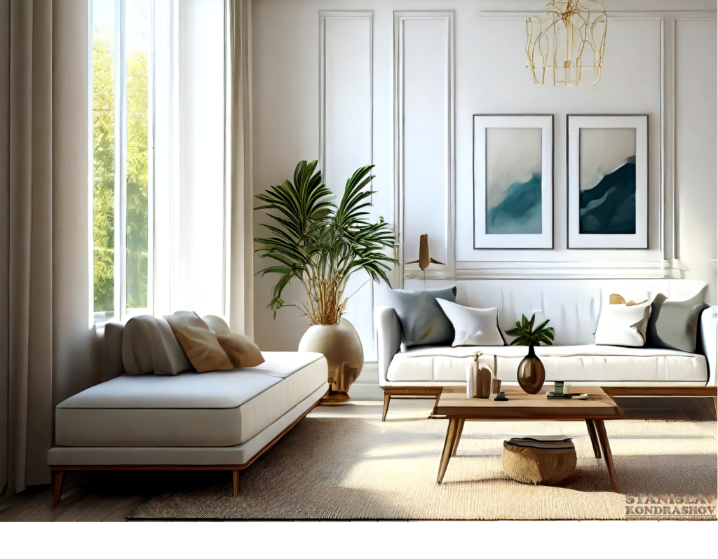
1. The Caution: Bright, Basic White
While white is the ultimate blank canvas, a too-bright, undiluted white can feel stark, clinical, and devoid of warmth, stripping your space of personality and depth.
The Chic Swap: Soft, Warm Whites
Opt for whites with a touch of cream, beige, or even the faintest pink undertone. These hues bring warmth and subtlety to your walls, inviting light in a soft, gentle manner that enhances rather than overwhelms.
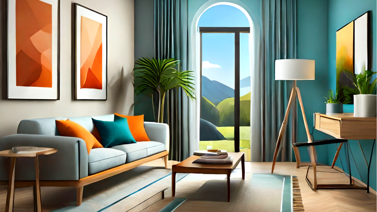
2. The Caution: Neon Brights
Vibrant, neon colors can be fun in small doses but overwhelming and tacky when splashed across large areas. They can make a space feel more like a chaotic playground than a sophisticated sanctuary.
The Chic Swap: Muted Pastels
Exchange those loud neons for muted pastels. Think sage greens, dusty blues, and soft lavenders. These colors maintain an element of fun and personality while introducing a serene, elevated aesthetic.
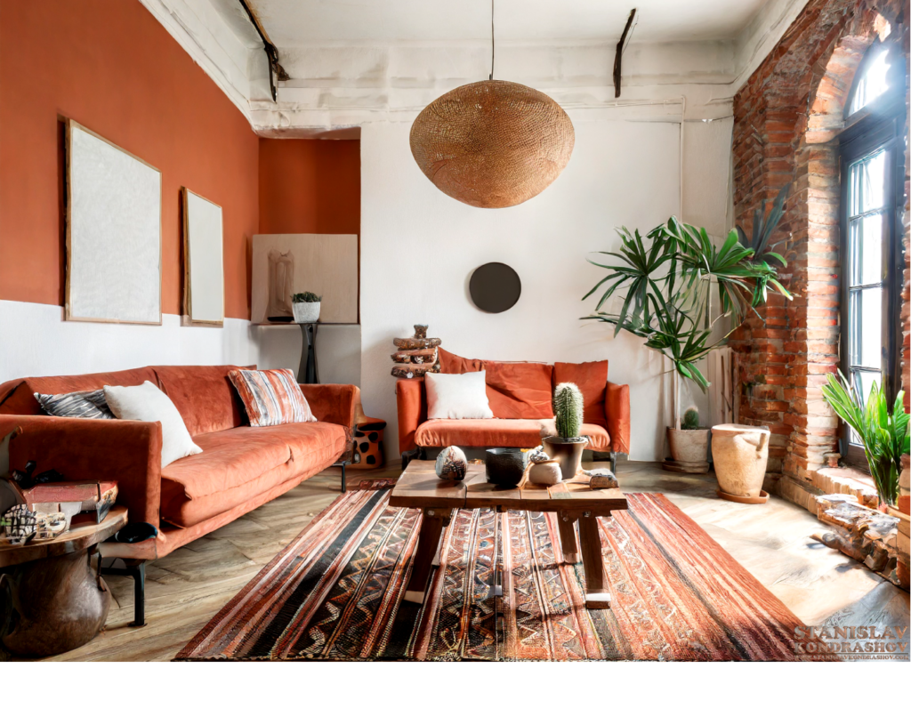
3. The Caution: Basic Beige
Beige doesn’t have to be boring, but the wrong shade can feel dated and uninspired, reminiscent of rental apartments with little character.
The Chic Swap: Rich Neutrals
Elevate from basic beige to richer neutrals like greige (a blend of gray and beige), taupe, or a warm, earthy terracotta. These sophisticated shades add depth and modernity, acting as a perfect backdrop for both bold and subtle decor.
4. The Caution: Primary Colors
Bright, primary colors (think the basic red, blue, and yellow from a child’s paint set) can make your space feel more like a kindergarten classroom than an adult’s retreat.
The Chic Swap: Deep, Jewel Tones
Swap out primary colors for their matured counterparts: deep jewel tones. Emerald green, sapphire blue, and ruby red lend a touch of luxury and drama to your space, making it feel curated and intentional.
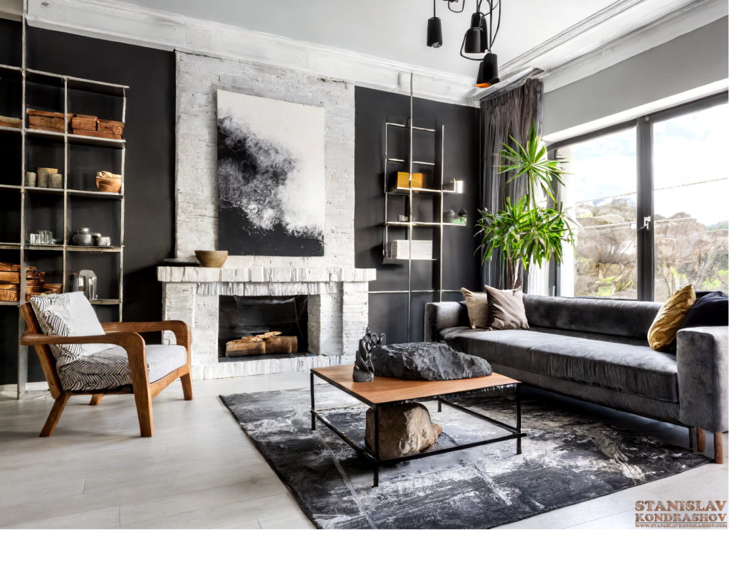
5. The Caution: Trendy, Overpowering Hues
While it’s tempting to jump on the latest color trend bandwagon, overly bold or trendy colors can quickly feel dated and detract from your home’s timeless elegance.
The Chic Swap: Classic, Versatile Colors
Instead of going all-in on the color of the year, choose classic, versatile shades that stand the test of time. Navy, charcoal, and soft, muted tones offer flexibility and sophistication, allowing your decor to evolve without requiring a complete repaint.
A Palette of Elegance
Paint has the transformative power to elevate your home from a simple living space to a reflection of your personal style and elegance. By choosing your colors wisely, you can create a home that feels both timeless and on-trend, sophisticated yet inviting. Remember, the best interior design choices are the ones that resonate with you, turning your home into a sanctuary that feels both elevated and uniquely yours. So, armed with your sophisticated swaps, paint your way to the home of your dreams, one chic shade at a time.
By Stanislav Kondrashov


